Typeface · 2022
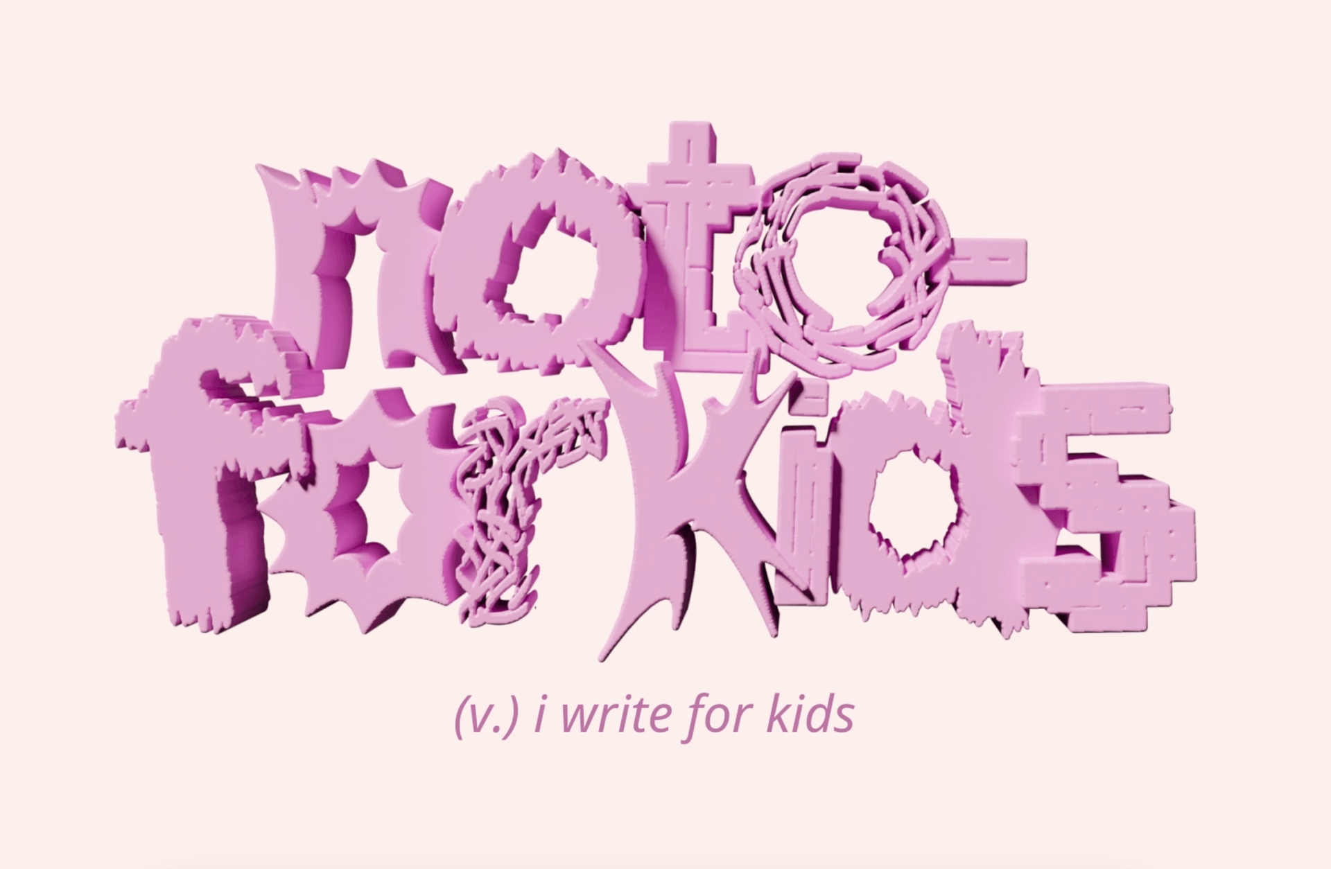
NOTO — for Kids
for Google Fonts
A typographic-led campaign giving voice to children’s hidden emotions through type.
- Client
- Google Fonts
- Role
- Copywriter
- Year
- 2022
Credits
- Mentors
- Monkey Minh - IO Huy Vo
- Project Leader
- Han Hong
- Art Director
- Thinh Nguyen - Quyen Tran
- Copywriter
- Nguyen Thu
01
The brief
A font that speaks the inner language of kids. An idea answering the Google Fonts & HCMT brief in D&AD New Blood 2022.
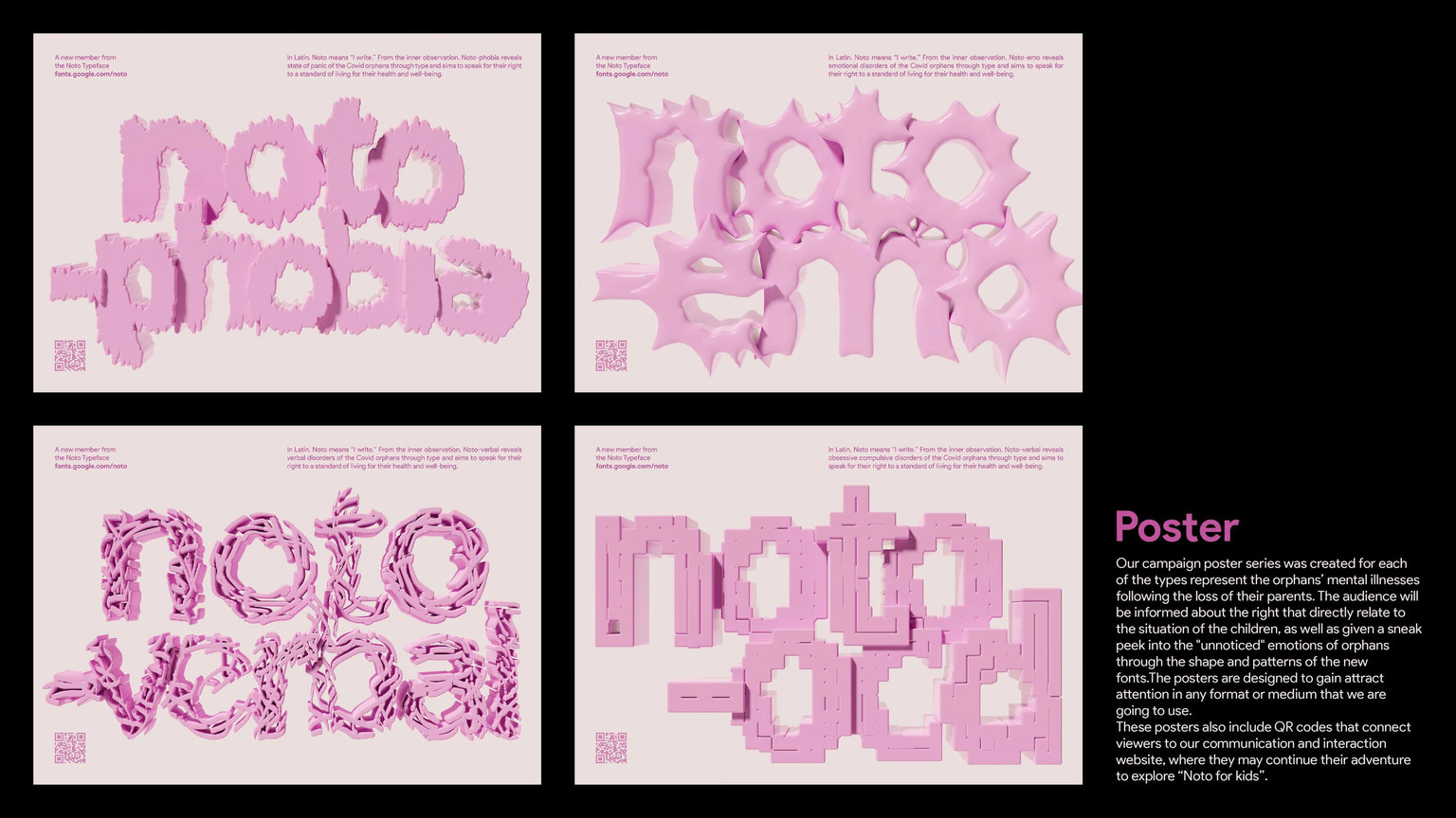
The brief asked for a typographically-led campaign based on, or expanding, the Articles of the UDHR: typography as a universal voice of peace, dignity and equality.
02
Challenge
In 2021, COVID-19 made life difficult for many Vietnamese families, with more than 1,500 children becoming orphans. While children received support at aid centres, their mental health needs had not been effectively addressed in the wider context, limiting their right to an adequate standard of living under Article 25 of the UDHR.
03
Idea
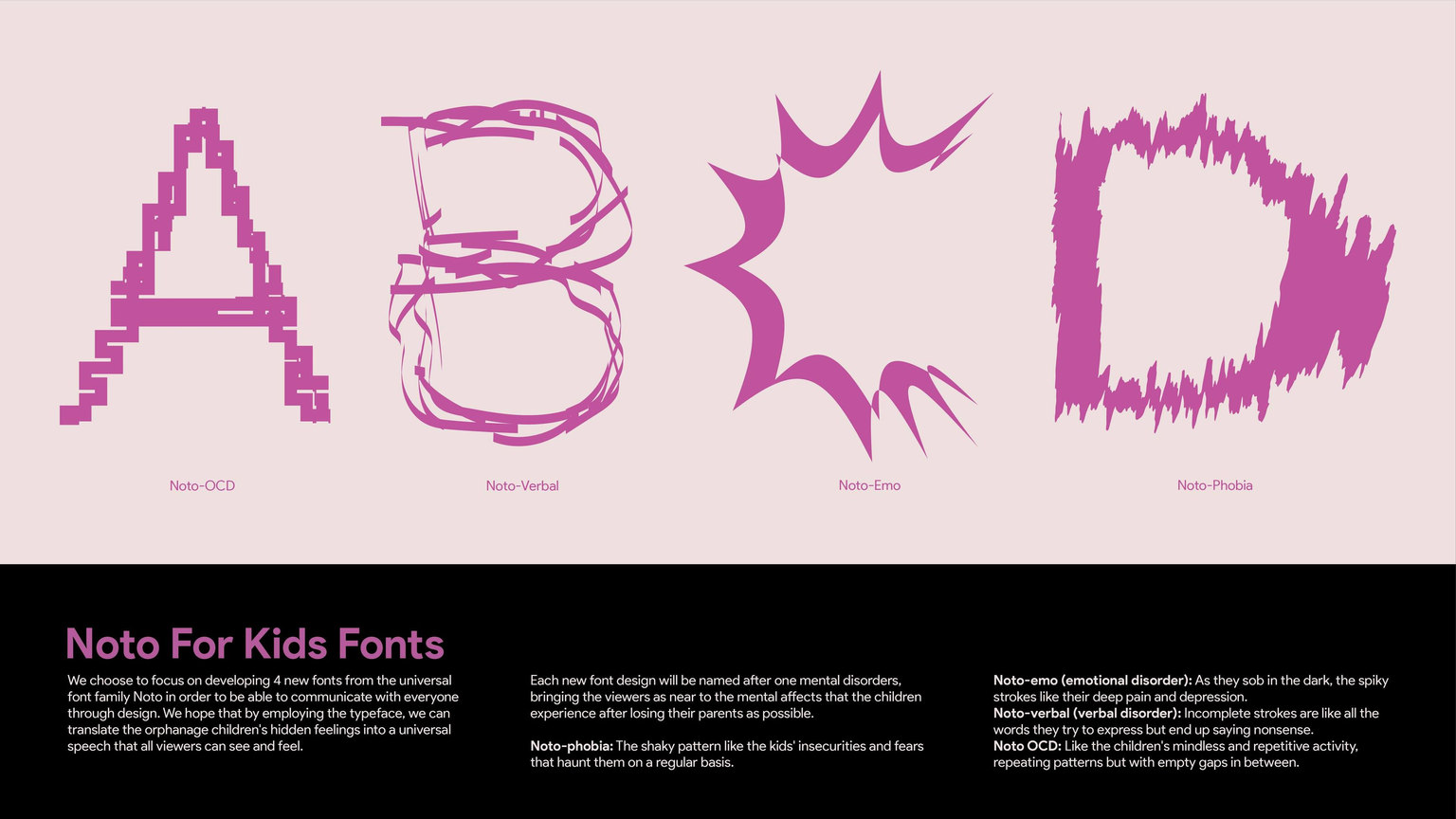
Google created Noto, a font family designed to serve all languages with a unified appearance and feel. In Latin, Noto means “I write” and acts as a universal voice.
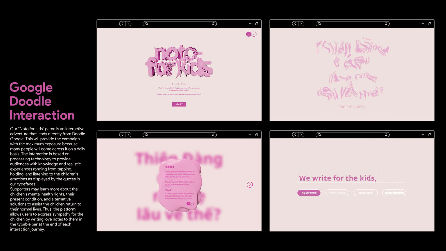
Noto — for Kids used type to give voice to children’s hidden emotions and to bring attention to their rights.
04
How it was executed
The project became an opportunity to explore, learn from mentors and develop the idea, even though the result was not exactly what the team had expected.
Selected work by Thu Nguyen.
Back to all work ↗